The Challenge
Ruth’s Chris had long been a destination for special occasions, but its identity leaned heavily on the formal, white-tablecloth image. The brand’s voice and visuals did not fully reflect Ruth Fertel’s approachable warmth, her grit, or the fact that Ruth’s is just as perfect for celebrating a Wednesday win as it is for a milestone anniversary.
The Solution
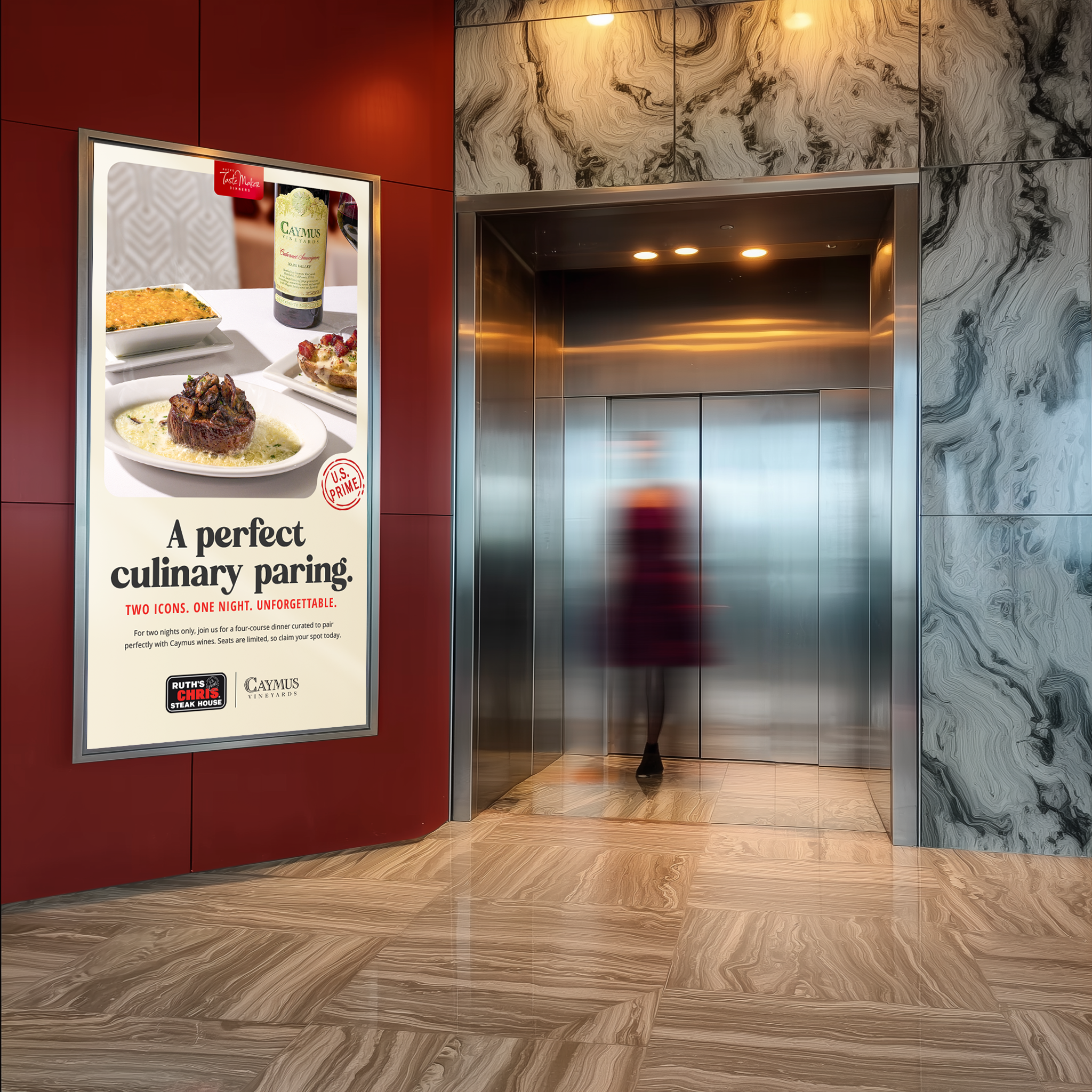
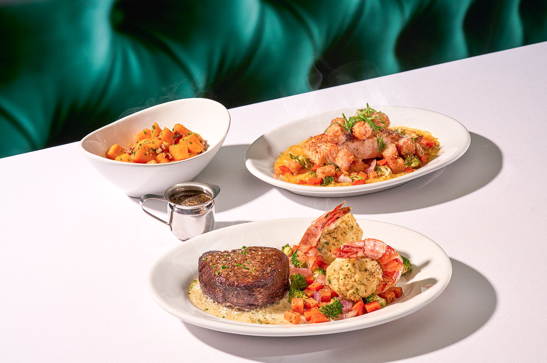
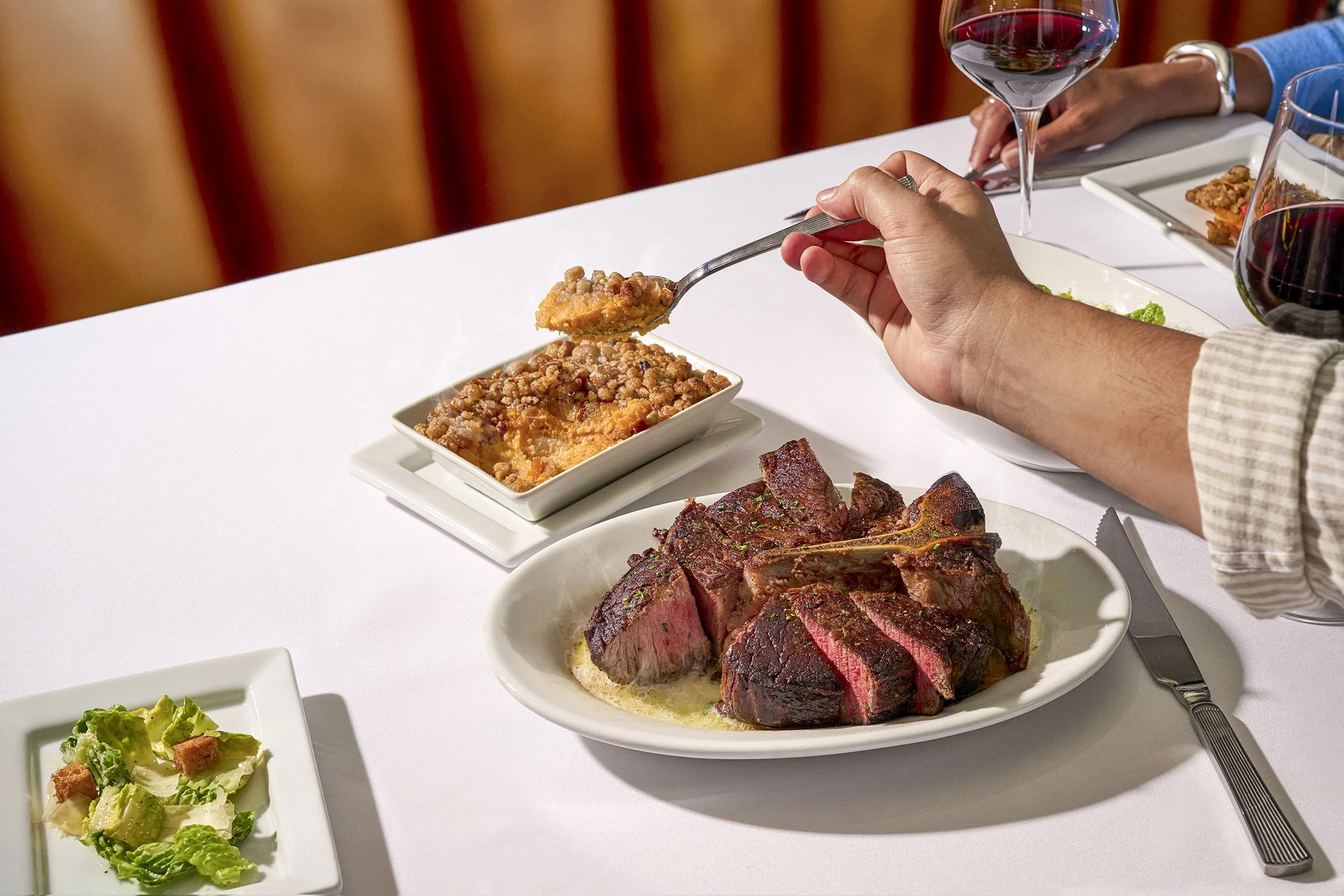
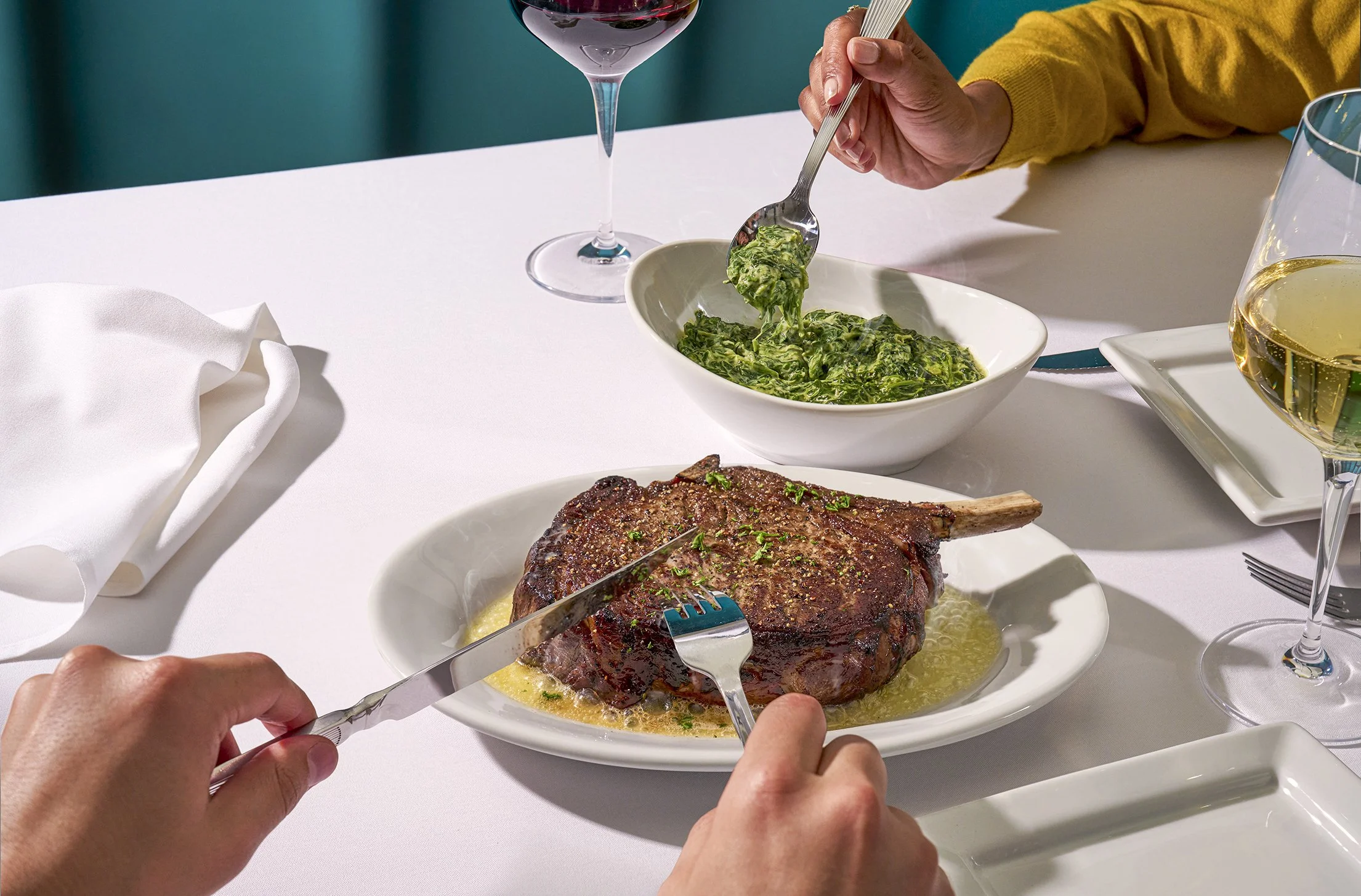
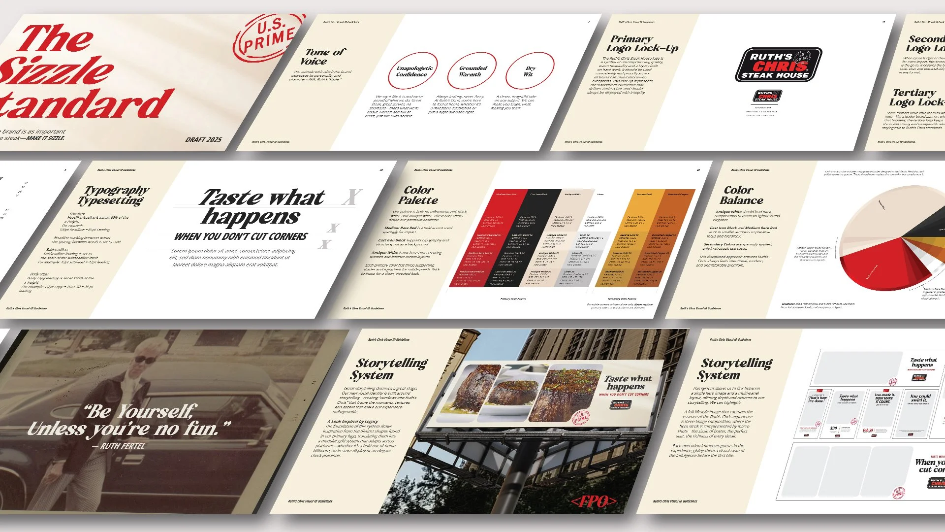
We set out to bring Ruth’s unmistakable spirit to life. That meant shaping a voice that is confident yet unpretentious and reimagining the visual identity to feel warm, inviting, and contemporary. Rich textures, glowing tones, and sizzling butter pops amplified the crave and sensory moments guests remember, creating a brand that feels as inviting for everyday celebrations as it does for life’s biggest moments.
